Mesh Mashup, and real life
Last week's assignment, I did many things to combine and mix to present my understanding about remix culture. I tried to make it unique, or thoughtful, but yet, not sure if it is well presented to the viewers who watch my posts. Also this time, because I usually like to attach the meaningful things with another, I'm trying to mix my two objects from the last assignment and go further with explanation about complicated meaning, in people's real life.
Now it is my result.
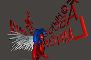
Internet flies with wordshot(#1, #5 in last assignment)
I explained that the internet is similar to the birds because it is borderless and free. However, in the other hand, some people are using anonymity with wrong purpose to hurt the other people. From many years ago, since the internet began to developed and spread all over the world, many people welcomed this source because it is very useful and comfortable to get the information without much effort. Social Network Services also was developed to make the people to communicate each other no matter where they live.
Still people use SNS to make a comment for other's saying, with guaranteed anonymity, sometimes they expose malicious word to criticize and hurt somebody because they do not know each other anyway. Ironically, convenience led the people to attack someone. It was the critical issues globally, not for my home country, just everywhere the people live.
Juxtaposition
I think is is a kind of juxtaposition because I showed both positive and negative sides at once. Meaning which is at the opposite side. That's why I chose these two objects from last assignment. I painted the mouth and the words with red color, and mixed blue with red for the internet logo because I wanted to present it has positive strength, but also has negative strength at the same time. (blue is original color of this logo, and generally color red means warnings.) In an instant, it could be seen as a object which has positive effect because the area where the wings are charging is large. But after that, if you see the middle of the object, it has the opened mouth with teeth that seems aggressive as it is looks like shouting. Furthermore, I adjust size of each words so it could be more dynamic with the realistic perspective.
Feedback.
From #1 : my colleagues gave me an advice to add beak on the logo because I said it is similar to the 'birds.' Instead, I added claws as there is already mouth(which is beak to the birds). As a result, It look like much aggressive monster. Effective way to represent in negative side in my object.
From #5 : my colleagues gave me an advice if I make the size of the words differently to be more dynamic. In a perspective, the object which is in front looks much bigger than the object which is behind of it. So I reflected this idea, and as a result, It became more looks like it's shouting. How fascinated!


Comments
Post a Comment